Wednesday, February 12, 2014

New Olympic Event: Polar Bear Snow Shovelathon


Some variations.  The last one is destined for a tattoo.

Which is your favorite?

Friday, February 7, 2014

Yawn


This is the finished piece.


A walkthrough...

I start in Corel Painter.  I have a reference photo that I'm only very loosely using.  The first challenge is just getting the basic shapes and proportions.  At this point I'm mostly trying to figure out the curve of the back, the hips, and the shoulders.  The head is barely attached right -- it's something I always have trouble with. The reference photo actually has a really straight back, but I decided to curve it.  I'm drawing using the Scratchboard tool.  The canvas is already 3000px x 3000px and I'm drawing on a new layer.  The pen is fairly thick at this point, maybe 60px.  This duplicates the feeling of drawing thumbnails -- the thick pen forces you to work on large shapes and not on details.
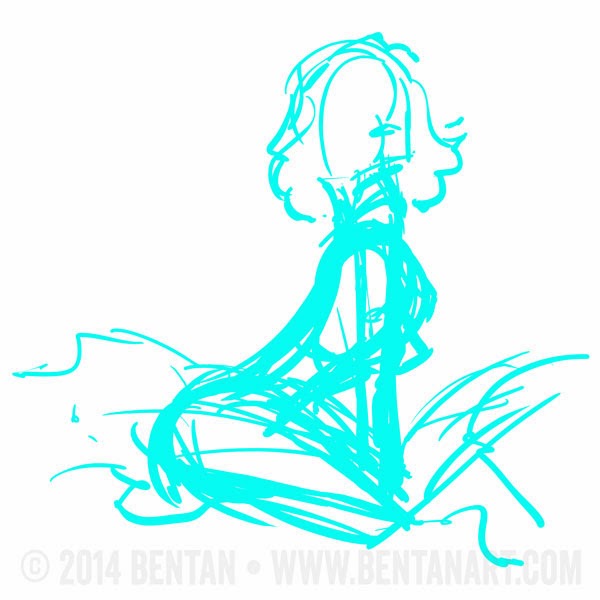
I create a new layer, and change the color of the pen.  Now working in the details.  I decide I want a shirt on.  Spend a little more time trying to get head and face in right.  At this point I decide that I want her to yawn, so I also add her raised arm to help sell that.  Notice how far everything has shifted from the blue.


Create another layer and hide the blue.  Still using the scratchboard tool, but now with black ink and a much smaller tip.  Maybe around 18px.  The key here is to draw very fast and loose -- if you draw slow, it shows and sucks all the life out..  If a line doesn't look right, undo and do it over again.  It can take me 10 tries to get a line right.  Notice there's a lot more shifting going on.  I'm relying on the red lines to give me the basic overall shape, but I'm shifting bits and pieces around quite a bit.  I also have to do a fair amount of refinement of some lines, erasing edges and filling in others.

Also, this started with just the body and the head.  I put the hair on another layer, and the back arm on another layer.  This way if I screw those up, I can easily erase them without erasing my original lines.  Later I merge the three layers into one.


New layer with the sheets.  Again so they can be erased, but also because I know I want the lines to be a different color.  I lightened the main lines just to emphasize the sheets here.  I didn't actually do that while I was drawing.


Lately I like to start coloring with the background.  It gives me some idea how to handle the skin.  This is still in Painter, on a new layer.  My standard coloring tool is the Tinting Basic Round.  I like how it lays down color and lets me do gradations.  Feels a bit like watercolors.


Skin coloring.  Same tools.  I erase a bit of the color for the highlights.


Shirt on a new layer.


Hair on a new layer.


Now I'm starting to evaluate the weighting of the overall piece and where your eye is drawn to.  I want it to be drawn more to the face so I try darkening her hair some.


Now coloring the lines.  To do this I move to Photoshop.  I create a new Hue and Saturation Adjustment layer and clip it to the ink lines.  Then adjust it until I get the color I like.


Add another adjustment layer with Hue and Saturation, this time for the hair -- it's slightly redder, though not so obvious now.  I then create a mask on the adjustment layer so that it's only modifying the hair lines.


Do the same thing for the shirt.  This time it's more obvious.  So now I have three Adjustment layers stacked on top of the lines.  I go back and forth tweaking the three until they kind of sit well together.  The blue's a little too strong in retrospect...


Adjusting again to shift the focus.  I lighten up the window area with a new layer painting white on it.


Another subtle shift here.  The brown body lines leave the mouth too light, so I add another layer and paint in a darker open mouth.


And a final texture touch.  I grab a texture of paper, put it on top, and set it to multiply. Then scale back the opacity until I get a hint of texture on the page.  Et voila!  The final piece!


Wednesday, September 11, 2013

Hot September Nights

This one was inspired by a story.  Let's just say that life stories were shared, and things got a little out of hand, and they had to take things into their own hands, but no they're not..., they're just friends.


The original rough sketch

First clean pencils.  This one came together pretty quickly.


And the final pencils.  You can see I adjusted the faces and head size and location quite a bit.  I was never quite happy with either face, so the final version I tweaked everything.


I also started painting this as a daytime scene.  I can't quite decide which one I like better.

Tuesday, June 4, 2013

Film Fun

Another Trinquette challenge piece.

Here's the final.


The initial sketch was pretty small.  Around 2k on a side.  I should consider doing this again because it worked pretty well.  The nice thing about working lo-res is it forces you to worry about form, not line or detail.


The first sketch came out pretty quickly based on the forms.  At this point I wasn't sure where to take the picture, but after roughly drawing in the shape of her hair, it reminded me of an egyptian headdress, and an idea was born.  It's pretty common for me to start a piece, not knowing where it's going to go and have ideas emerge during the sketching.


And then I did a quick color test to get a general sense of how I wanted to color.


This piece was unusual in that I went straight from the rough pencil above to the final painting, blocking out basic color forms and adding painted lines to delineate the edges.  Usually I start with much more precise pencils.  But this seemed to work out pretty well.

And this is a facebook-safe version.


Tuesday, May 21, 2013

Warrior Woman

Here's yet another Trinquette Challenge piece. (http://www.facebook.com/trinquettebooks)

The final piece (actually this isn't the version submitted):

This is the version I submitted.  After submitting it I realized the colors on her face look really muddy, especially when compressed and reduced.

And the cleaned up pencils.


Wednesday, May 8, 2013

Space Girl

Here's another space girl from the Trinquette challenge.

Here's the final:


The original sketch.  I was pretty happy with this.


The colors changed the flow quite a bit.

Here's the first pass. Her jaw felt a little too square in this one.


This was a candidate final:


Here's a closeup of her face.

As I stared at this one of the things I realized was that I didn't have enough contrast in my color values.  So I took another pass at darkening the skin.  I also tried a different background color:

The background color wasn't quite doing it for me though.  It brought out her skin tones nicely, but it also seemed to compete with it.  So for the final I went back to the blue.

Sunday, April 28, 2013

Recline

Here are some shots from the latest Trinquette Alternate Challenge.


The final piece.


The original sketch


A facebook-safe verison.


Sunday, April 21, 2013

Slave (Trinquette Challenge April 20)

Just a quickie post here.  More details later.


And here's the Facebook-safe version.


Here are the finished pencils.  I actually like the pencils much better, which suggests this probably needs a repaint/recolor.

Monday, November 19, 2012

Dejah View

This is another commission, but I kind of went over the top with it.  Unfortunately I forgot to export more in-progress pictures, so you'll have to do with the sketches.

Here's the final version.


This is the first rough, just getting basic shapes.  I used a photo ref for the base pose.

I was trying to figure out what to do with her front leg as the pose seems a little unnatural.  Though what I was trying to do was even more unnatural.  So I just went back to the photo.

Here I'm trying to clean up her eyes by redrawing from scratch, but they completely lost their character.

So I went back to the original eyes.  Gotta love layers!  And added the background.


The painting was done on about 20 layers.  For each element usually a flat color, then various lighting/shading layers on top.

Saturday, November 10, 2012

COMMISSION: Lauren and Tara

This was a commission for Aidenke's (http://aidenke.deviantart.com/) characters Lauren and Tara.

This is the final.


And a peek at the process.  Here's one of the first ideas.


This one was my favorite.  It's both erotic and playful.  But Aidenke wanted a side view.


So this is a pretty late stage sketch side view.  For some reason I've been having a lot of problems with profiles lately, so I changed the seated figure's face quite a lot.  The girl on top's face came really quickly though.

At first I started coloring using my standard chalk brushes, but it didn't seem to fit the picture and pencils.  The colors ended up looking really messy and too gritty.  So I threw them all out and started from scratch with a more comic-book coloring approach.  This seemed to work better.